Global Brand Refresh
Figma
Adobe Photoshop
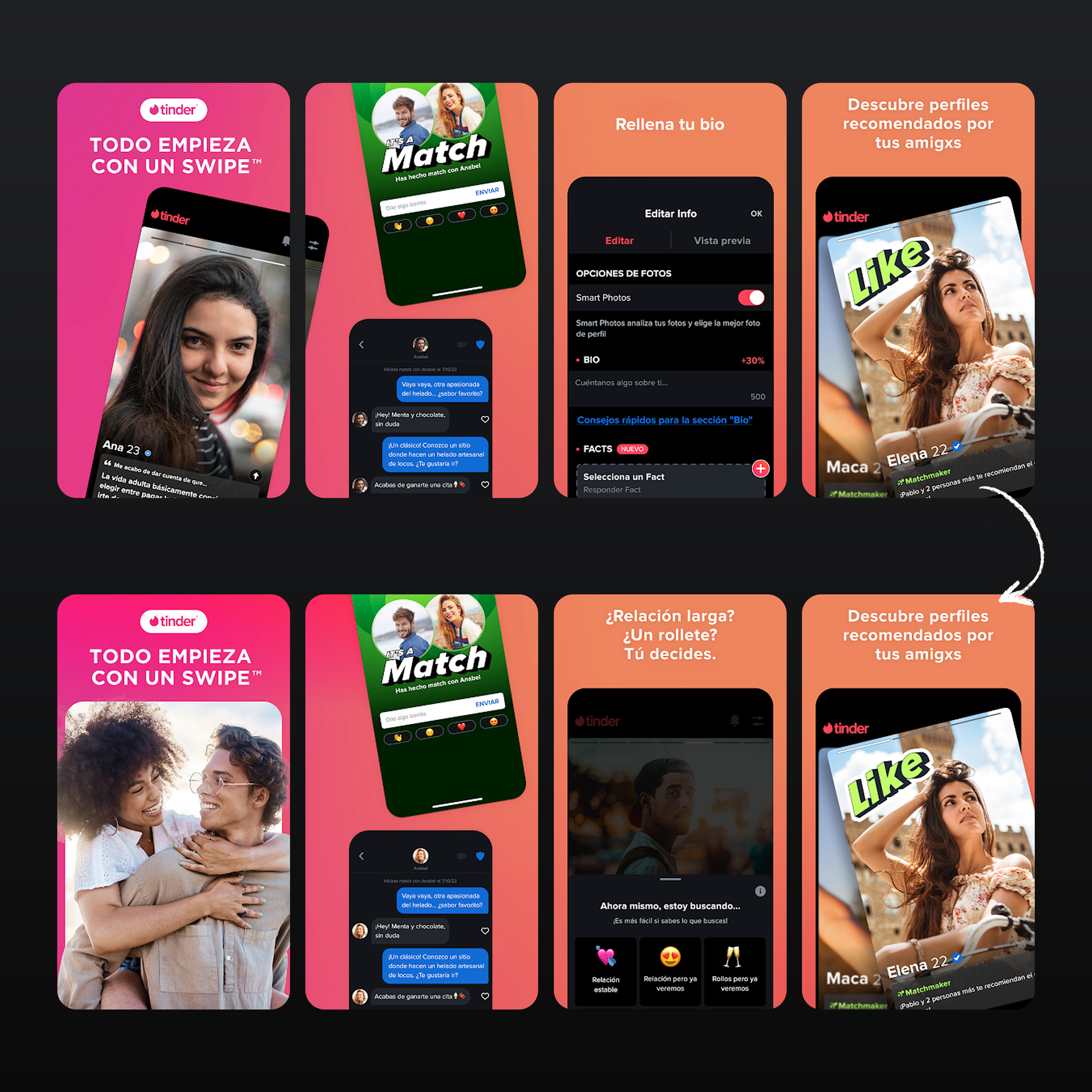
I played a key role in designing the rebranded App Store and Google Play Store marketing assets for Tinder. Using the new design system as a foundation, I refined and expanded components to create materials that were visually compelling, brand-consistent, and told a clear story. A key challenge was not only maintaining consistency across global markets, where Tinder’s brand identity and assets had become fragmented, but also introducing new design elements. Since the brand had historically taken a conservative approach, even small additions, such as icon pop-ups, required careful consideration. We addressed this by finding a middle ground that respected the brand’s history while allowing us to evolve the creative expression. The new set established a stronger foundation, tested in both dark and light modes, and rolled out in over 50 languages, localised for each market. The images below are examples from this global initiative.
ROLE
↳ Art Direction
↳ Performance-Driven Design
↳ Rebranding
↳ Strategy & Reporting
-
![]()
United States (Before & After)
The refresh began in the US, focusing on making the product stand out by testing both dark and light modes. I updated the provided UI to fit a more compelling narrative, introducing the new gamepad, icons, and features with a more vibrant colour palette.
Refreshed US listing delivered a +1.5% uplift in new installers in only 2 weeks. -
![]()
Sweden (Before & After)
The set in Sweden was outdated and did not showcase an accurate experience to users. The Refreshed Set in Light Mode performed well in this territory.
Refreshed Sweden listing delivered a +12.53% uplift in new installers in 3 weeks. -
![]()
France (Before & After)
Refreshed France listing delivered a +2.6% uplift in new installers in around 3 weeks.
-
![]()
India (Before & After)
The set in India was outdated and did not showcase an accurate experience to users. The Refreshed Set in Light Mode performed well in this territory. The localisation of this set also included a bespoke “Match” screen.
Refreshed India listing delivered a +4.3% uplift in new installers in 2 only weeks.


In-App Events
I design In-App Events around seasonal opportunities and new feature launches, often working as the sole designer on these projects. Some of my designs have been featured on the Apple App Store's main page, which has increased visibility and driven downloads. Each event card can reach up to 100M impressions, making them one of the most impactful assets for awareness. Usually, I receive a written brief and early UI elements, which I then develop into event cards that promote the feature while staying aligned with Tinder’s brand. By working within the design system and building on it where needed, I have contributed to the way Tinder presents new features and seasonal campaigns in app stores.
ROLE
↳ Art Direction
↳ Performance-Driven Design
↳ Illustration & Photo Editing/Retouching
↳ Typography

Figma
Adobe Photoshop
Adobe Illustrator
Adobe After Effects
Feature
Artworks
Figma
Adobe Photoshop
Adobe Illustrator
Apple and Google often reach out directly to Tinder for featuring opportunities, and I am usually given open-ended briefs to turn into final artworks. I take these loose directions and translate them into designs that align with Tinder’s brand while standing out in highly competitive placements. These artworks significantly increase visibility on a global scale, with some campaigns reaching over 200–300 million unique impressions.
ROLE
↳ Illustration
↳ Creative Direction
↳ Photo Editing/Retouching
↳ Brand Expression


Creative Optimisation
Figma
Adobe Photoshop
I lead the design and testing of App Store and Google Play assets from concept through to delivery, collaborating with Tinder’s product marketing team on concept development and then driving execution and rollout. My work often involves shaping market-specific strategies (e.g. copy style and tone, narrative, light vs. dark mode, user imagery, and layout variants) to identify the strongest direction for different audience groups. By building experiments within Tinder’s design system while evolving it where needed, I have helped increase installs and engagement while strengthening brand consistency across markets. Tinder’s creative direction had historically leaned toward safe, conservative design choices, which was understandable for a well-established global brand. However, following the global creative refresh and establishment of a strong visual baseline, there was a clear opportunity to improve creative performance further.
ROLE
↳ Creative Strategy
↳ Performance-Driven Design
↳ A/B Testing & Insights
↳ Conversion Optimisation
-
![]()
United States (Before & After)
The main idea was to shift the narrative from a functional, product-led approach to a more personable one. We achieved this by improving readability, adjusting the tone of the copy, introducing UI pop-ups showing a variety of content, and creating overlapping profile cards to indicate a match, along with refining the UVP, hero image, and feature order.
The winning US test indicated up to a 3% uplift in new installers -
![]()
India (Before & After)
Before the global refresh, we tested updated layouts and approaches in India to make sure the refresh would be successful. The results from this market also informed our decisions as we prepared for the global rollout.
The winning India test indicated up to a 10.6% uplift in new installers. -
![]()
United Kingdom (Before & After)
After the global refresh, we wanted to further optimise the creatives to achieve incremental improvements and wins. Staying within the new system we established, I focused on increasing readability, storytelling, and composition, which led to a positive result.
The winning UK test indicated up to a 4.6% uplift in new installers. -
![]()
Spain (Before & After)
We wanted to make sure our tests continuously improved conversions. For Spain, I approached this by adding dynamic couple imagery and changing the order of features to showcase a more outcome- and goals-focused narrative for this market.
The winning Spain test indicated up to a 10.4% uplift in new installers.